Design thoughts:
Photoshop Skills Used:
Fonts Used:
Franklin Gothic Heavy
Calibri
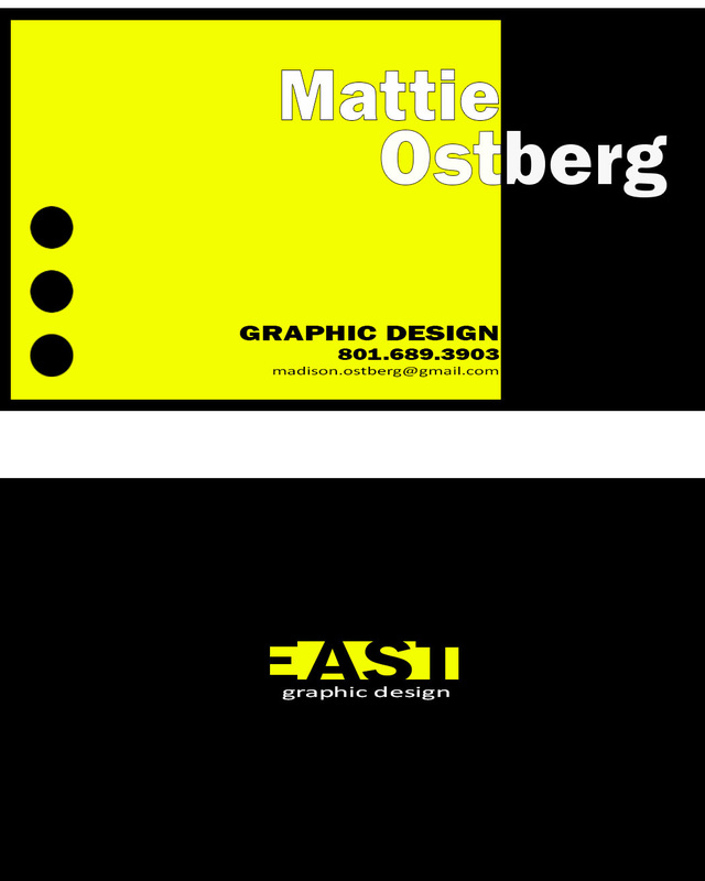
I like clean and simple designs, which use pops of colors to create contrast and to catch the eye.
- Contrast: I used the bright yellow against black and white to create contrast. I also used a large bold sans serif font to create contrast with the smaller fonts.
- Repetition: I used the circles to create repetition.
- Alignment: The individual text sections are aligned with the right side of the square. With parts of the larger text stratling either side of the line. The information on the front of the card is centered.
- Proximity: Sections of information are arranged by their closeness to each other. For example, my name is grouped in one section and the contact information and job are located in smaller black text below.
Photoshop Skills Used:
- Text tools to create the text layers.
- Layers for each of the main elements on the page.
- Using artist boards to design the front and back of the card.
Fonts Used:
Franklin Gothic Heavy
Calibri
I like clean and simple designs, which use pops of colors to create contrast and to catch the eye.
