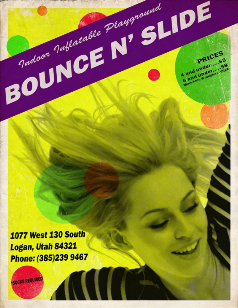
Design thoughts:
• Contrast: I used the bright yellow against its complimentary color purple and black to create contrast. I also used a large bold sans serif font to create contrast with the smaller fonts, and the smaller cursive font.
• Repetition: I used the circles to create repetition. I also used the same text for the less relevant information.
• Alignment: The individual text sections are aligned with their left and right edges. I used the alignment to connect different sections of information.
• Proximity: Sections of information are arranged by their closeness to each other. For example, the prices are grouped in one section and the contact information is in the other corner.
Photoshop Skills Used:
• Layers for each of the main elements on the page.
• Layer opacity used on the shapes, fonts, and figures.
• Camera raw used to enhance the photos and desaturate the image.
• Color range select tool to grab the desired sections of the original image
• Layer masks used to get a section of the image without damaging the original
• Layer blending to create a vintage texture appearance.
• Text tools to create the text layers.
Sources for images I've used:
Girl: http://faestock.deviantart.com/art/Jumping-Action-Pose-Reference-503111650
Paper Texture: http://bashcorpo.deviantart.com/art/Grungy-paper-texture-v-5-22966998
Print Texture: http://skeelar-stock.deviantart.com/art/Grunge-Texture-II-198119698
Fonts Used:
Franklin Gothic Heavy
Brush Script MT
Franklin Gothic Book
When I found the original flier I was shocked at how dull the bounce n’ slide looked, and how complicated it seemed to go there. I think the two most important elements of creating a flier advertising a bounce park is making it look fun and quickly informative. In order to make this poster look more fun, I grabbed a stock image of a young woman mid jump and zoomed in on her face. I used the balls around her face to try and create more motion, depth, and color. As for information I cut out the majority of the text on the original flier, limiting it to the what, where, contact information, and cost.
